hey, thanks so much! this might get a lil long (as it always does!!) so bear with me.
firstly i want to say, there’s no right or wrong way to pick colors. every artist has their own palette they prefer and i think it’s super delightful to spend time developing your own special sense of color. so even though i’m explaining things in a “this is how you do it” sort of way, it’s not the only way! just my way. the best method to develop your own sense of color is to look at a LOT of art, look at a LOT of the world around you, and practice practice pratice.
at this point in my life i pick colors intuitively just because i think it’s something i’m naturally tuned into, and i’ve been doing it for a few years, so i don’t actively plan my palettes. but here are some things that i think about as i pick colors.
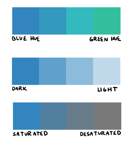
firstly, i want to go over hue, value, and saturation. i’m sure everyone knows these intuitively but i want to explain them in words. hue, value and saturation are what make up a color, and decide how colors differ from each other.
hue: what color the color actually is. red, purple, green, yellow, and everything in between.
value: how light or dark a color is. if you’re painting traditionally, adding more white or more black to a color lowers or raises its value.
saturation: how “pure” the color is vs how much neutral tone is in it.
here’s an example of all three:
this comes into play because a big mistake i see beginners make is that they pick a “just” color, and by that i mean they pick “just blue” or “just yellow”. imagine buying a set of oil paints and only using paints straight from the tube without ever mixing. it would be impossible! so i try to avoid picking “just” colors, except as for a complementary color (more on that in a bit). here are some variations of a red, for example.
so, the biggest thing for me when i pick colors is that i want them all to be friends. i want them all to have something in common so that they get along. i usually lose control of a painting when my colors feel to different from one another. so, i will usually start a painting with one color i know for sure i want, and “subordinate” other colors to it, meaning every other color i pick has to look good with that color. as to how you figure out what looks good and what doesn’t, that just takes time and lots of observation to build a personal opinion 🙂 here’s an example from one of my paintings. in this case, the main color is the trees.
and here’s another from rick & morty, the main color is the sky this time.
now that that’s out of the way, i’m going to give you the Actual Cheat Sheet for color palettes. in color theory, there are 8 basic color schemes that are generally pleasing to look at. here they are.
i usually use an analogous palette or monochrome palette out of preference. the two examples above more or less fall into those categories. however, i also like to use split complementary because the complimentary color adds a LOT of contrast and visual interest. it’s great to use if you have a specific thing in a painting you want to draw attention to. here’s an example:
it doesn’t always have to be a perfect split complementary, just one color that differs from the “family” of colors that take up a majority of the piece.
now! you might be wondering when’s the right time to subordinate a color, or where to put it, or how much of it to use, etc. and the answer is: CONTRAST. there is always visual interest in things that are different. i was rifling through my school notes and found these great types of contrast when working with color.
value: things that are light vs things that are dark.
hue: two colors that look different. I.E. yellow vs blue.
saturation: things that are saturated vs things that are desaturated.
proportion: note the example above. a majority of the painting is orange, so the green stands out because there is proportionally less of it.
temperature: things that are warm vs things that are cool.
complementary: red vs green, blue vs orange, yellow vs purple. when in doubt, these colors always contrast against each other because they have nothing in common (there is no red in green, etc).
simultaneous: this is a little advanced and i’m bad at explaining it, so please read up on it here.
a super helpful exercise is to look at your favorite illustrations, paintings, photographs, designs, etc and assess which one of the 8 color schemes (linked above) it has, and which types (can be more than one) of contrast it has. we did this in school and it REALLY helped me look at color better. here’s part of the assignment i did, the artist is annette marnat.
so! that’s pretty much how i think about color and how i pick my colors! i hope it was somewhat helpful! there’s so so so so much about color theory i can’t even begin to cover, i highly urge you to watch some videos and read some books and articles to further your study. a great starting place would be this series of videos. these are made by my teacher Richard Keyes, i think he had a dvd or something. everything i’ve talked about so far i learned from him and he is an absolute expert in color. these videos are invaluable. if you take anything away from this post, let it be to watch these videos hahaha.
to answer your question about my color leads, every painting was a collaborative effort between the three of us, and sometimes other painters too. it was a very hands-on crew, so i can’t say any of the r&m bgs i did are 100% “mine”. however, i think my personal color sense is waaaay different than jason or phil’s, which made the process very interesting because we usually had 3 very different opinions hahaa. you can check out their work here and here to see what things they brought to the table in relation to my own contributions.
thank you for the ask! again, i hope this was helpful 🙂
You know those characters that are constantly referred to so smart or so capable or so sensitive (etc. etc.) by other characters or in the narration? And every time it comes up you find yourself shaking your head or rolling your eyes because the character in question either is as bland as boiled potatoes or constantly acts in ways that contradict those claims without explanation?
That’s what is commonly called an “informed trait”. You’re told the character is a certain way (or has a certain ability), but there is more or less nothing in the text to back that up.
It goes the other way around, too, with informed flaws that are supposed to make a character more relatable or interesting – think almost every romantic comedy leading lady who is supposedly “shy” and “clumsy”, but in a cute, endearing way that only ever comes up when the plot asks for it.
It’s frustrating, distracting, incredibly dull and at times downright insulting to the reader to encounter a story where one or more characters have a bad case of this, but unfortunately, it’s a pretty common weakness even in otherwise strong, well-written stories with interesting and complex character concepts.
Since characters and how the reader feels about them (whether they are supposed to relate to them, look up to them or feel repulsed by them) can really make or break a story, informed traits are an easy trap to fall into and many a writer’s Achilles heel.
So, how to avoid them?
This is where the trusty old “Show, don’t tell” comes in. You have most likely been told before that it’s usually better to go for subtlety and leave something to the reader’s imagination than to spell it out, and that is true.
It’s challenging to imply something without outright saying it. You have to get creative with the details you want to put into your story to get a point across by relying on your audience’s ability to read between the lines, and while it’s absolutely worth it to go the extra mile, you also run the risk of making your narrative too stilted and contrived instead.
However, there is a fairly simple trick to make your characterization feel more natural and insert it into the story smoothly:
Stop thinking of your characters as possessing certain traits and start thinking of their personalities as a collection of habits, preferences and specific abilities.
It might not sound like that big of a difference, but it will make translating your character traits into text much, much easier and save you a lot of trouble while editing.
Some examples:
A “smart” character
This can mean a lot of things. You could have a character who is booksmart, learns quickly, reads a lot, can retain information easily and access it when needed, but has trouble applying theoretical knowledge in real life, someone who entertains their friends by telling them about weird facts and trivia, someone who can still recite poems they had to learn by heart when they were ten, someone with a tendency to talk in such complex run-on sentences they frequently forget what they were talking about half-way through. Or you could have a character who is good at problem-solving instead, who likes puzzles and riddles, who gleefully obsesses over odd problems to find even odder solutions, but thinks so far out of the box in order to remain engaged in their current task they often miss the forest for the trees.
A “brave” character
Try to instead make a character who can never resist a challenge, who is a thrill-seeker and went bungee jumping about a dozen times already, who enjoys dragging their friends on the most dangerous looking rides in an amusement park and endlessly teases them about how pale they went afterwards. Make someone who simply cannot stand by when they see someone else get bullied, someone with a collection of scars they wear proudly and a story to tell about each one.
A “shy” character
Forget about characters who blush prettily when spoken to and that’s it. Instead, write about a character who can’t make eye contact without forcing themselves to, who stumbles over their own words when talking to strangers, who is afraid of wearing bright colours because it might draw attention to them, someone who is humble and polite, but distant and comes across as cold or uncaring because they have tendency to hide their insecurity by retreating into themselves, even though seeming rude is the last thing on their mind.
Insert these habits into the story wherever they fit best. Be consistent in the portrayal of your character’s behaviour, even as character development kicks in. Adjust deliberately, but reasonably. After all, old habits die hard, so having your character break with one, however minor, can be a powerful moment with just as much emotional resonance as a flashy, dramatic scene meant to convey the same sentiment, and any “big” scenes will likely feel more organic if the reader has already seen traces of the necessary character changes before.
“Stop thinking of your characters as possessing certain traits and start thinking of their personalities as a collection of habits, preferences and specific abilities.”
I wish that ao3 had an option to filter warnings (and tbh certain authors) out like I will never ever want to read it and just seeing it puts me off so much that often I end up closing my browser because that content upsets me so much lmao
There is a way to do this but I can’t recall how to do it. it’s something you type into the box for “other filters” or something, I don’t remember. who knows??
It’s not a great option, and I don’t know if you can sort out authors that way, but it’s better than nothing if someone can reblog this with how to do it!
Alrighty friends! It takes some specificity, but you can do this. Let me show you how!
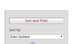
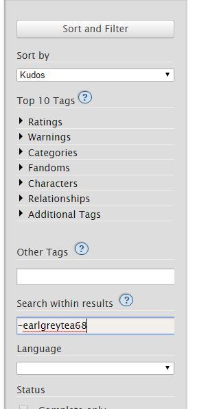
So I started with going to the Sherlock (TV) section of Ao3. On the right we find this lovely section! ((I know I’m going over things you already probably know, but I figure this post may go to new Ao3 users, so bear with me.))
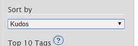
Underneath this, I chose sort by Kudos, because that’s a quick way to find most popular fics, for the sake of this demonstration.
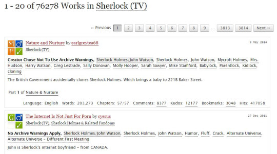
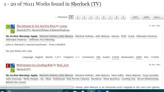
With those filters on, we end up with this being our first two results:
As you can see, we have Nature and Nurture by earlgreytea68, and The Internet Is Not Just For Porn by cyerus. So what if I am utterly sick of seeing earlgreytea68 on my list? Let’s pretend I’ve read all their fics, or that I just don’t like her, or whatever. I want this author out. I go to this section on the right:
In “Search within results” I type earlgreytea68 into the bar, with a minus sign in front. This gives me the following page, upon hitting the sort and filter button:
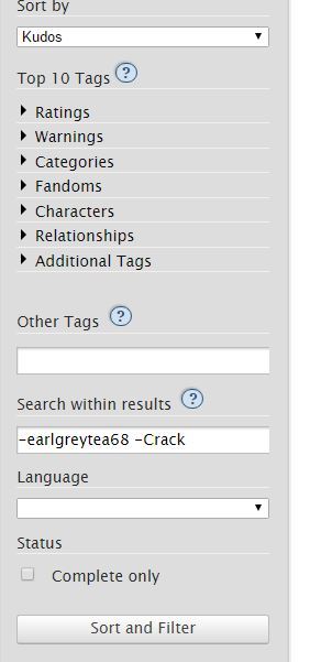
There goes earlgreytea68! But now I’ve decided that Crack is just not my thing, I’m sick of that, too, for heaven’s sake, I want something reasonable in my gay slash fanfiction about detectives that solve crimes about glowing dogs and irish megalomaniacs. Heaven forbid this get ridiculous.
Well, then I add this to my search:
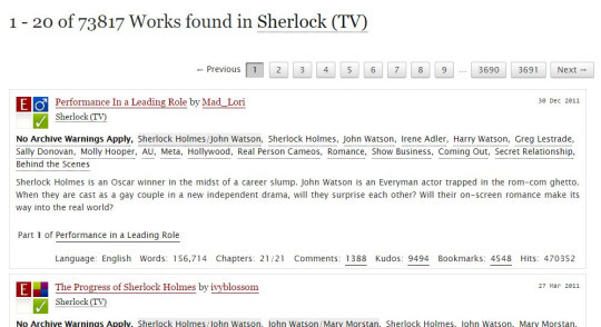
Which gets rid of everything with that tag. My results are now:
Performance in a Leading Role is now my first result!
You can do this as many times as you want; the biggest problem I have is trying to filter out multi-worded tags. For example, “Secret Relationship” is hard to filter. Better to go with authors you dislike or with words like “DubCon”.
I hope this helps! Also remember that googling site:archiveofourown.org and then adding search terms will mean google searches Ao3 for you, and sometimes that works far better.
Good luck!
An excellent in-depth guide! Thank you!!
omg changed my whole ao3 rarepair game
An excellent guide to filtering on AO3!
You can filter out phrases by enclosing them in quotes. For example, if ABO and Hydra Trash Party are not your things, try:
-“alpha/beta/omega dynamics” -”hydra trash party”
I have more advice!
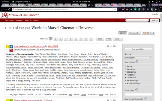
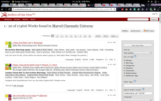
Say, you’re in your random fandom- I went with the Marvel Cinematic Universe, since I’ve been reading Iron Man stuff recently. Tony Stark is awesome.
But anyway, you’re on the page, and you see that there are 174,774 works! That is way too many for a casual afternoon’s browsing.
And you see that the first one is Peter Parker/Tony Stark and that is not your jam. It doesn’t work for you, or it squicks you, whatever. Wouldn’t life be easier if you could browse without seeing that pairing (or whatever pairing you don’t like)? You can!
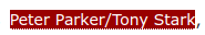
First, click on that pairing tag(You may want to open this in another tab, actually.):
and it’ll take you to the page for that pairing tag. Click this button:
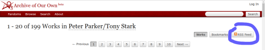
and then look at the address bar! The actual page is unimportant. Copy the numbers located here:
and go back to the original search page! Down on the side, in the same place you can get rid of other tags, type -relationship_ids:”the number you just copied”
Then hit ‘sort and filter’ annnd… magic!
The fics with that pairing are gone! You can also do multiple pairings, get rid of any tags you don’t like, and sort it by date or length or kudos, or whatever.
don’t just pay it. do not automatically pay the hospital bill when you receive it. call your health insurance provider and POLITELY say, “excuse me, i just received a bill for $1200 for my hospital visit/ER visit/etc., is that the correct amount i’m supposed to pay?” because hospitals bill you before your health insurance and they will take your money no matter how the amount due may change based on your health insurance looking at it. 90% of the time, if your health insurance is in any way involved in the payment of that bill, you do not have to pay as much as the hospital is billing you for. call your health insurance provider first, and POLITELY request clarification, always remember that the person you are talking to is human and this is just their job, and then you will very likely find out you actually only owe $500.
don’t shout at anyone about it, don’t get mad, just understand that this is The Way Things Are right now and call your health insurance provider before paying the bill your hospital just sent you. there’s a chance the hospital bill might be correct, true, but call your health insurance provider.
THIS IS SUPER IMPORTANT. after my car accident last year the hospital billed me ~$8000. They sent me letters asking me to pay, and I called them back saying my insurance was processing the claim. This is also what I told the collection agency when they kept calling me about the $1000 emergency room fee (billed separately from the hospital fee, mind you). Once everything got straightened out, all I was actually liable for was my $200 emergency copay.
!!!!!!! things my ass didn’t know !!!!!!!!
Yes this is a life lesson my adulting ass didn’t know I needed and I’m out 80 bucks for an anti-nausea pill. 😒😒😒😒😒
Reblogging for American friends.
Also, it is important [for people receiving medical care in the USA] to carefully read all of the items on the medical bill and look for errors and overcharges. I know that the normal feelings of avoidance and dread can make it hard to look at scary hospital bills, and that’s okay! But as the OP mentions, private orgs like hospitals don’t monitor overpayment of bills – they are motivated to charge you extra – and it is basically impossible to get your money back. Read the bill carefully and make sure that the charges are correct, using the links below for help if you need. If they haven’t sent you an itemized list, you can ask for one. Sometimes you will be charged extra for items or treatment you didn’t receive. Most people don’t know that you can dispute medical bills! But in 2009, Consumer Reports stated that 8 out of 10 medical bills scrutinized by a watchdog had errors, and generally you are not obligated to pay for someone else’s error.
You may be charged for using medication that you actually brought into the hospital with you – that’s easy to dispute! You may be charged for the consumables used during your stay such as sheets, gloves, gowns, etc – the hospital should actually cover that under its running budget. You may be charged for a brand name drug if the generic was available for cheaper – the links below explain how and when you can dispute this. You may be charged a surprisingly expensive “oral administration fee” (where a nurse puts pills for you to take in a little clean paper cup and then hands it to you) but that’s worth disputing if you were actually able to take the pill out of a bottle and put it in your own mouth. And so on.
I got a $900 charge for an anesthesiologist with my first child. I had a natural birth with no epi. Why that charge was there was never explained, but basically he showed up as I was delivering & stood around so I guess he thought he could bill me for being in the same room.
Thanks so much for your ask! I’ve meant to do a tutorial like this for a long time. This is the way that I draw big girls, though it’s quite a short and basic tutorial. I hope it helps!
the “area of gain” part was pretty much taken directly from -here-, a VERY informative and helpful tutorial. Here’s a couple of tutorials that I think are pretty good: link and link.
So, I play Flight Rising and for those that don’t know it’s a basically a pet website that auto creates pets based on a set list of parameters. For example, you pick the color blue and say it has tiger stripes and the website generates a dragon image that’s blue with tiger stripes. Anyways~ I got to thinking, can I make something like that? I used to work in other adoptable communities as a coloring artist, but we’d always have to do the markings and the colors ourselves. Well, I love making things easy for myself so I decided to take a crack at learning how to code (cuz that’s easy right? /s)
Python. I’m starting at ground zero with coding, but I have heard that if you’re gonna learn how to code, python is the easiest language out of them all. My understanding is that it took all the mumbo-jumbo out of the stupid little characters all over the place and packed them into nice, easy to understand command words. Easy peesy, but I’m I wanna create images, not words. Turns out python has a pretty sweet image processing package called pillow. Double sweet. Enough talking, time for pretty pictures.
The artwork. I got my hands on some pretty sweet deer (and later flying tiger) lineart from a gaia user named “breedable art by V”. All the lineart you’re about to see was original drawn by this person. With artwork in hand I started writing my script. I broke the deer down to four levels, body color, marks, accent stuff, and the lineart. So that’s three colors and the ink. Turned out to be pretty easy to get the code to prompt the user to ask for a rgb value and then color the artwork.
Boom! Mission accomplished. The image on the left I colored in photoshop and the image on the right was generated using the code I just scripted. I can’t tell the difference. I was so excited and happy that I actually did what I set out to do that I wanted to take it to the next level. I commissioned a bit more complicated lineart and set up the script to work with the new artwork.
Done. Now, this image is actually a lot more complicated than the deer image. I’ve broken down the artwork to primary, secondary, and tertiary (much like FR). With coding you have to stay super organized or else everything can turn into a hot mess super quickly so there’s three levels with sub levels in each section. In primary, you have the base color of the body with the second level of markings that are colored slightly differently. Notice the legs and face markings. Those are the 2nd level in the primary level. I’ll take another term from FR and call this gene basic. The wings are made up of three levels in their basic gene. By breaking the artwork down like this, I’m able to get the code to create more complicated images. Now the fun part, creating a list of colors and organizing the code in a way to accept more gene artwork. After basic I made tiger stripes (they are based on tigers after all… well, with wings).
The code works! I always do a little victory dance when I add to the code and it works because I’ve found that adding tends to break things. The script can now recognize the colors I picked and named, while also understanding what I mean when I say ‘basic’ or ‘tiger’. I don’t have to actually type in the three numbers for the rgb color code (that was super tedious btw). I made a list of 55 colors, gave them names, and generated a compliment and accent color list based off the main colors. You can see the color lists in action with the wings. The color fire is made up of an orange, yellow-orange, and super orange color. If that makes sense.
Now that I got the code organized to accept new genes, it’s time to expand. New gene: cloud and tint.
So I pretty much got the code working good for one set of lineart, how would it handle another set? Time to get the code to ask the user if they wanted male or female lines.
Now it can do both, no problem. Next step: adding in blend modes. So in photoshop, you can tell the layers how to interact with one another using layer blend modes (multiply, soft light, etc.). Right now the code just adds images on top of images and spits out a final file that has everything together. Well, I want the script to calculate layers. It’s how you change the black lineart to another color. In photoshop, I’d set the layer to soft light. I figured out how to do it in the code and before long I got the script to spit out an image that was much richer than the simple black lines.
It was also at this point I added the shadow layer since I multiply my shadows on the artwork. The artwork is a little messy because the black lines covered up a lot of coloring mistakes, but I went through and fixed it.
Here’s what the program do right now:
I’m super pleased with how things have turned out so far. I have plans to add in a child stage and get the program to generate a random child image based on the parent’s colors and markings, but that’s the next stage. Right now I’m having fun generating a bunch of cool images and thinking up ideas for new genes to add. Thanks for reading and don’t be afraid to learn something new!
You can actually add your own images into it if you want to compare more dynamic characters or use alternate poses. And I’ll show you how owo
1. You go on the site:
2. Left click the image and scroll down to inspect:
3. You see those two links down there? Those are the image links for the sillouhettes, just add your own image (must be a url, i personally like imgur):
4. And bingo bango! You got your own custom images to compare heights with! I hope this was helpful owo
I stg if this becomes my fucking legacy as being the most popular post I’ve ever made I’m going to punch something
that feel when your own post makes it’s rounds back onto your dashboard